This project was an exercise in branding meant to expand our understanding of everything that goes into brand guidelines and rebranding a business. This project was done under Professor Paul Nino using Adobe Illustrator, Adobe Indesign, Adobe Photoshop, Adobe Stock Images, and Freepik.
Research
To begin this project we had to choose a company, preferably a non profit and redesign their mark and brand guidelines. For the research phase it was important to look into other companies with similar goals or status. The non profit I chose is Art Possible, a company devoted to inclusion of people with disabilities of all ages in the art world.
Iteration
The first step after research was to begin ideating ideas for a new mark. While iterating we were asked to sketch iconic, indexical, and symbolic symbols first and then more on to combining our previous sketches into something new. I approached this by finding common symbols for different actions, feelings, or states of being that already exist, and then putting my own spin on them. When combining my symbols this process was helpful in the sense of being able to combine multiple ideas to create a larger concept.
After our first few batches of iterations we began refining our options. Through feedback, I found that people were drawn to lifework that resembled a paint stroke in some way.
Process
After receiving more input from my professors and peers I was able to narrow down my mark
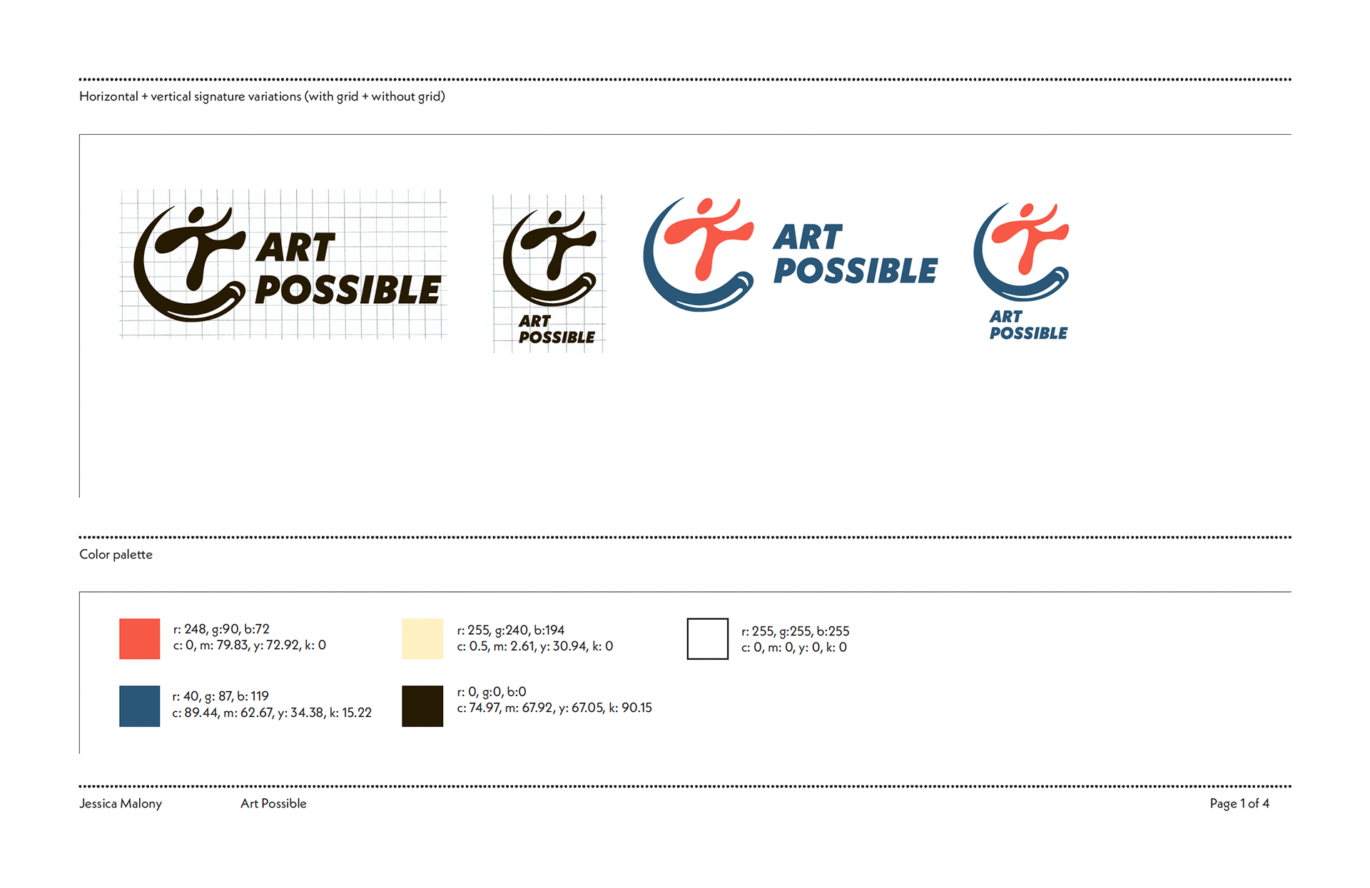
The mark itself connects back to the accessibility symbol with a paint swoop resembling the wheel from the disability symbol. It is meant to invoke a sense of freedom, accessibility and creativity. With the mark established I went through refinements so as to make it on a graph for duplication purposes. Additionally I did user testing using google forms to receive feedback on the energy of my mark and learn whether it was communicating the way I intended.
Overall my user testing was well aligned with my intentions. at that point it was time to begin incorporating color. I wanted to mimic primary colors without being too direct when choosing my color palette.
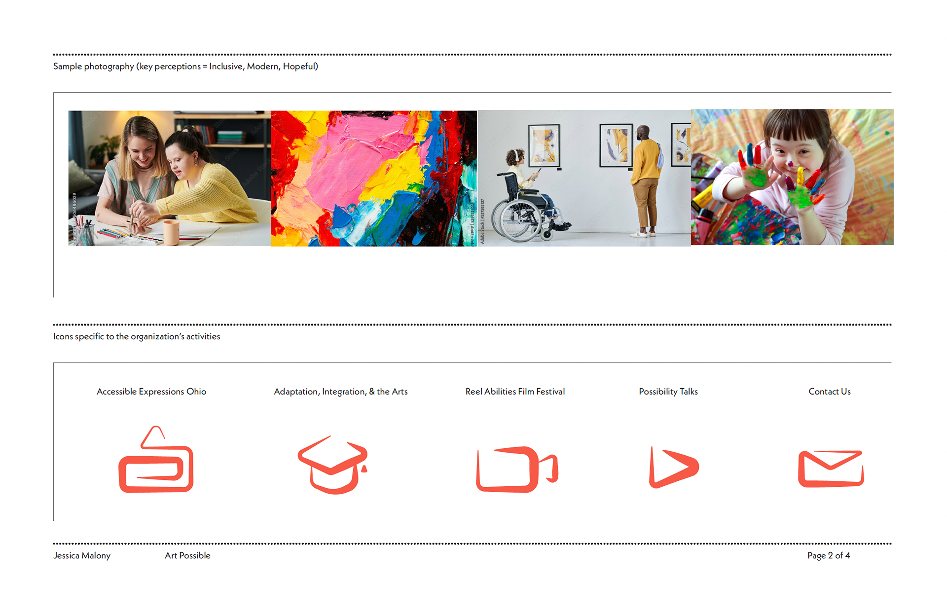
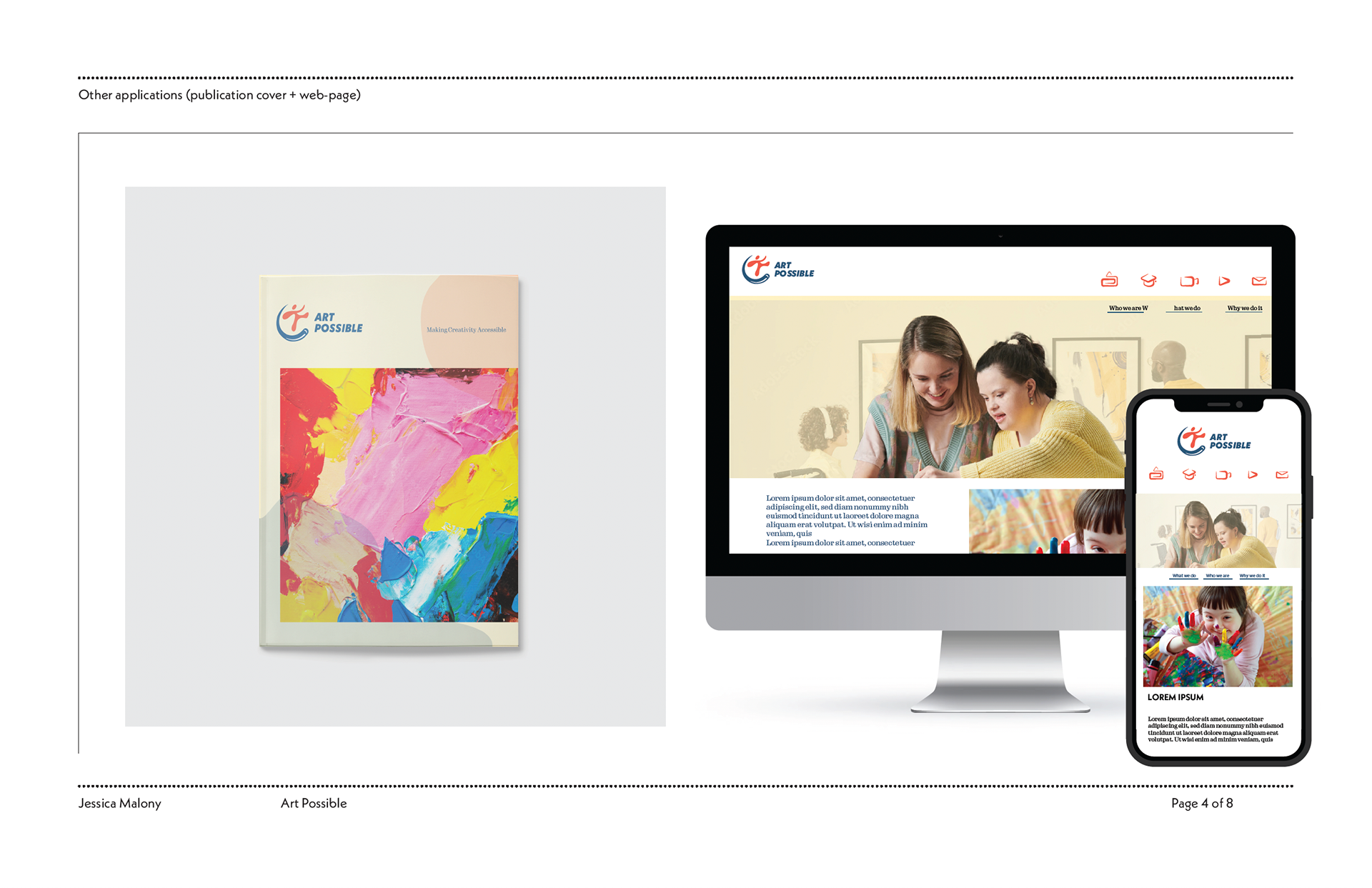
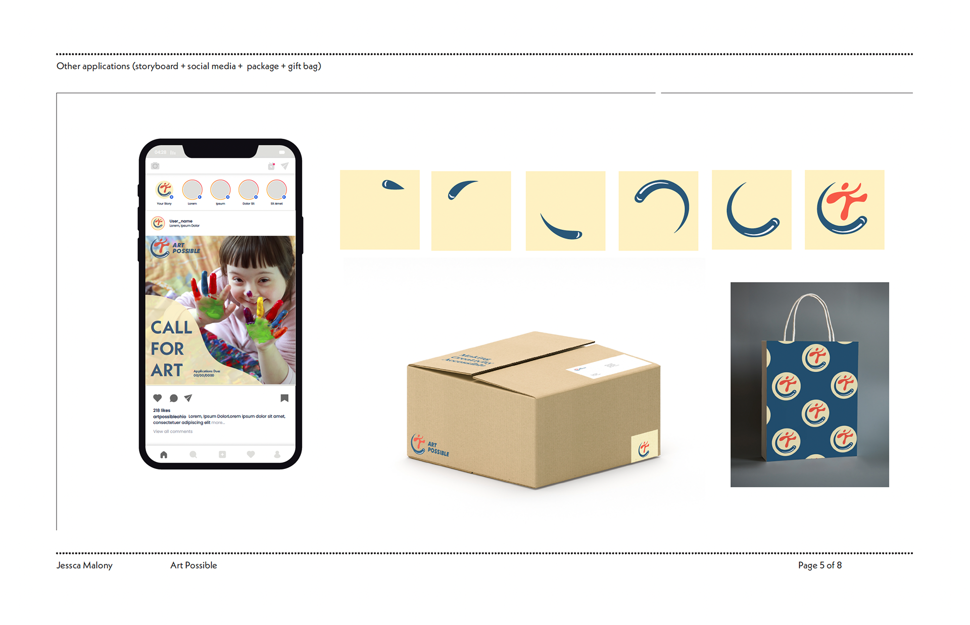
For phase two of the project it was time to introduce a logotype, define typography usage, a symbol set, sample photography, and mockups of how the brand assets should be used.

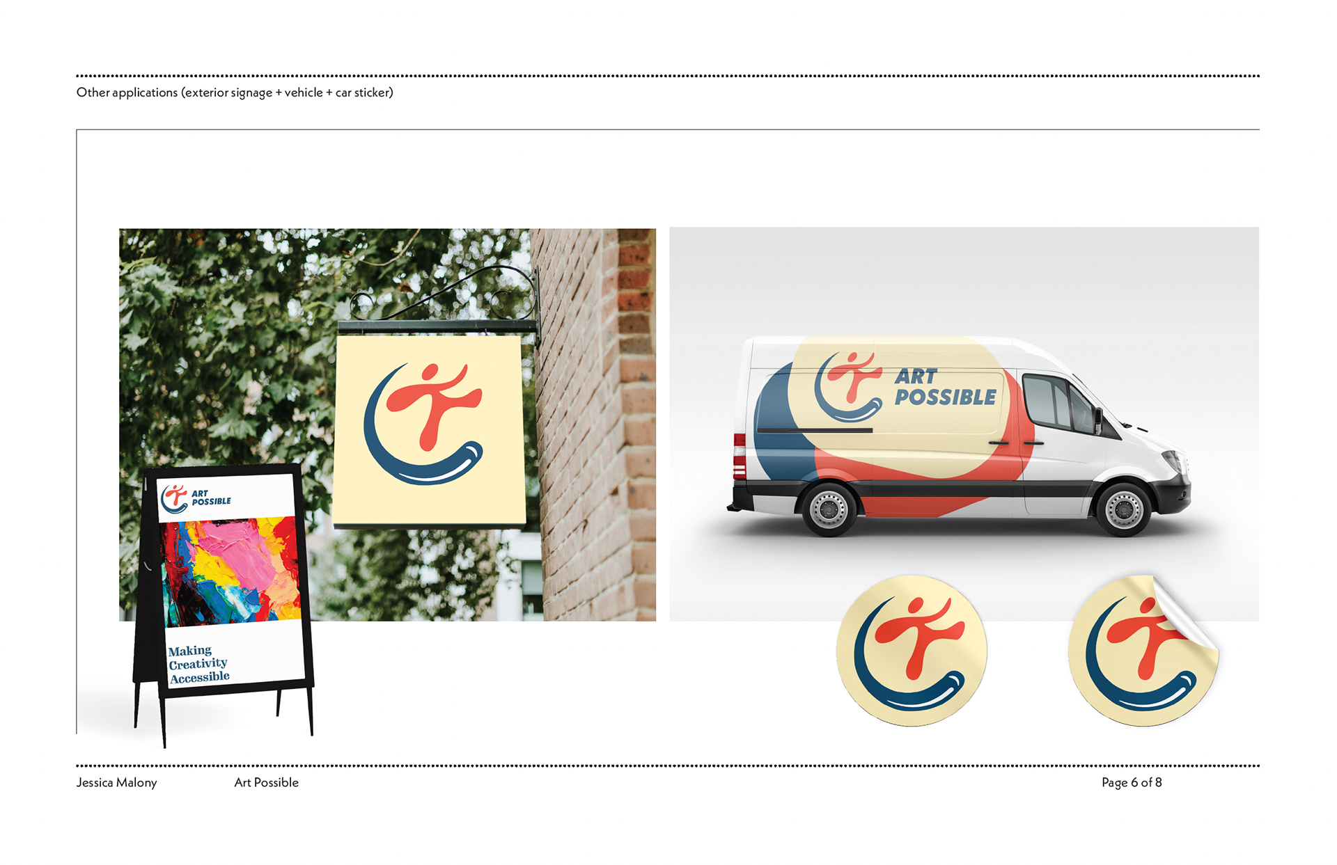
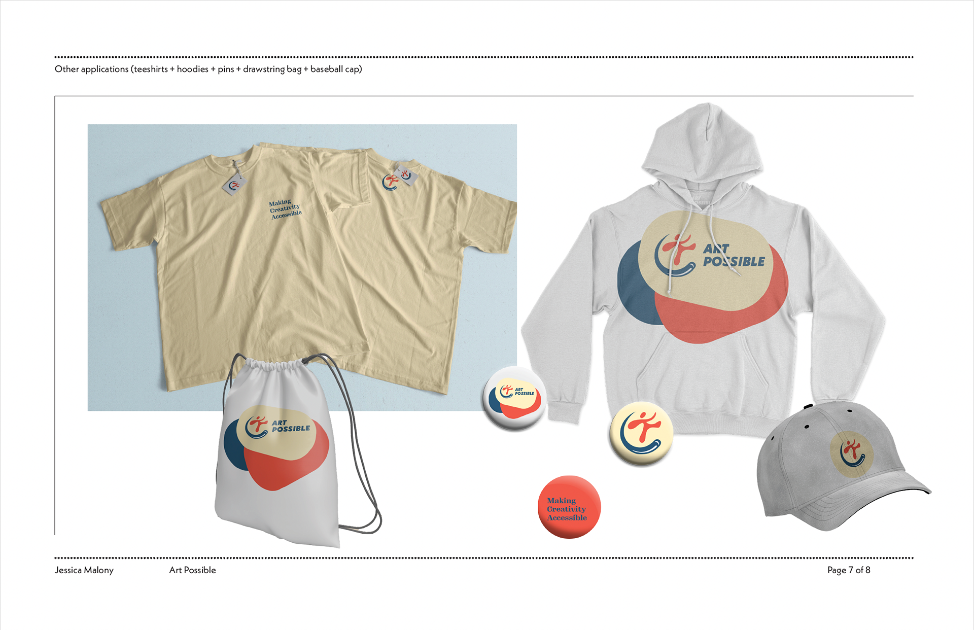
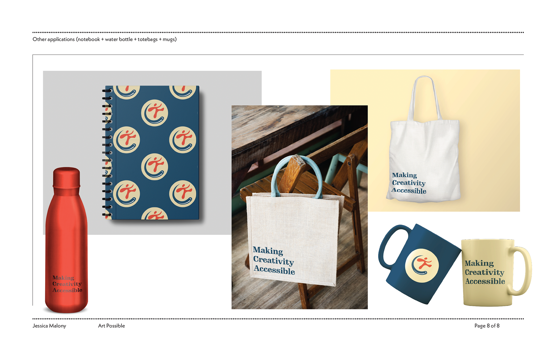
Final Product
