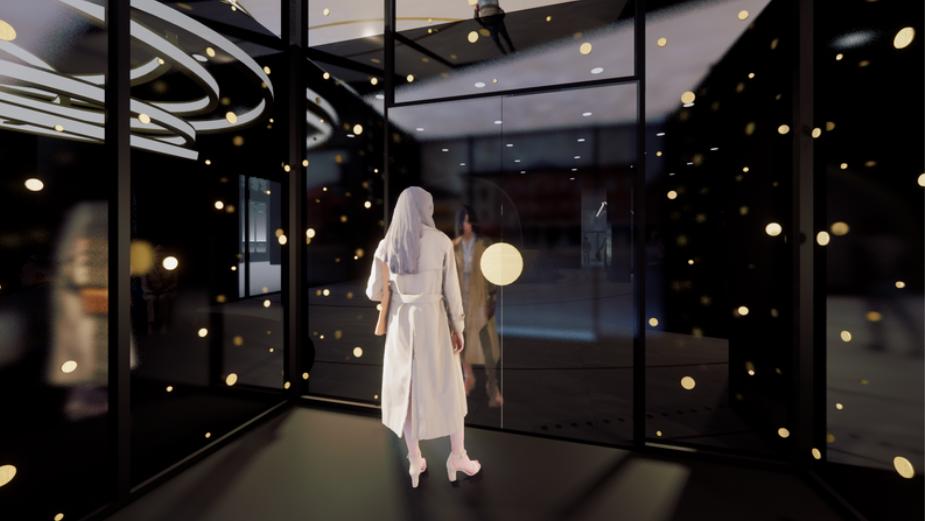
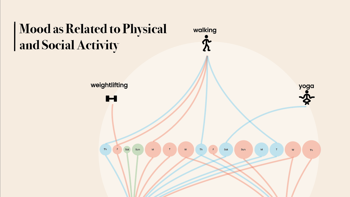
This project requires the development of a mobile data dashboard that tracks both quantified and qualitative data to craft a personal narrative. Done under Professor Yvette Shen this project was completed using Figma, Adobe Photoshop, Adobe Stock Images, Freepik and Adobe Illustrator.
Research
Defining the Target Behavior: This data dashboard is meant to be used as a touchpoint for a wide variety of data so that users can connects trends and correlations in order to better understand what impacts their health and wellness in order to make educated decisions for themself as well as being able to share the data with their doctor. The types of data this app is currently tracking includes sleep quality data, nutritional habits, activity reports, heart rate, liquid intake, stress and mood.
Identifying Data Sources: Approximately half or the data being tracked can be done using a wearable device such as a Fitbit, smart watch, or smart ring. The rest of the data is meant to be tracked manually in order to gain insight into the user's actual experiences or qualitative data. For example sleep times and quality would be tracked using a wearable device but the tiredness level of the user is tracked manually as it may contradict the quantified data.
Problem Statement: Chronically ill people or people experiencing chronic pain often struggle to find reliable and simplified ways to track health data to be shared with their doctors and/or used personally to better understand their illness and how to increase wellness.
Objectives: The objectives of this project are to create a data dashboard that simplifies complex layers of information to make the app itself usable for a wide variety of people in various states of wellness. Additionally this project aims to provide a safe, less clinical space for users to create a personal narrative regarding their individual symptoms and health habits as well as the connections between them.
Target Users (proto-persona):
Ideation
With my concept and goals in mind I began sketching ideas for main dash boards. First we did an exercise for class where we had to make three possible dashboard concepts.
After Initially ideating dashboards, we began sketching different screens that fit with our concept
With some key screen concepts in mind I created an intial flow chart for my different screens and how they connect to each each other.
Initially my first prototype looked pretty much identical to my sketches, but I found that things felt disjointed so I went back to the drawing board for my Home Screen and switched from at first having everything on the Home Screen to being able to swipe between two screens which I ultimately found to be even less intuitive. At that point I decided to make icons and labels for everything and make it more intuitive to toggle between screens by using buttons at the bottom of the dash for key screens.
Process
I began my process by making wireframes for my app screens. This was done using sigma, photo shop, and adobe illustrator.
After developing wireframes and receiving feedback I created a mood board to influence me as I developed my UI style Guide.
I used the above mood board to influence my first prototype.
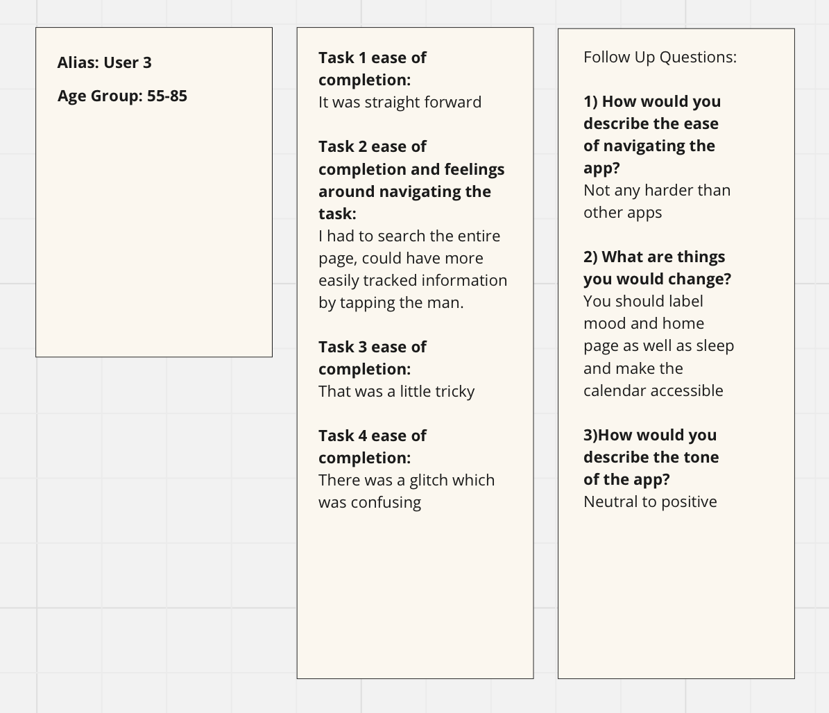
I tested this prototype with a peer and two people more fitting for my persona to receive feedback as I designed my Style Guide and wrapped up the Hi-Fi prototype.
For feedback from my peers I did usability testing with the goals of discovering:
Is it intuitive?
How do you navigate instinctually?
Can users find the swipe function?
Can all features be accessed?
What are the pain points?
What is the tone of the app?
Does it have everything you need?
When testing with my peers my script went as follows,
“Hi thank you for testing my app. Just some background information- this app is meant to be a health metric tracker with the intent of tracking chronic pain or illness and the elements of wellness that play into having symptoms.
First I would like you to log your mood. How would you rate ease of completion? Now can you navigate to and log your pain? How did you feel about navigating that task? How would you rate ease of completion? Next find and review your sleep report. How would you rate the ease of completion? Lastly can you find and review your activity report? How would you rate the ease of completion?
My Key tasks were 1) logging mood, 2) navigating to and logging pain 3)finding and reviewing the sleep report and 4) finding and reviewing the activity report.
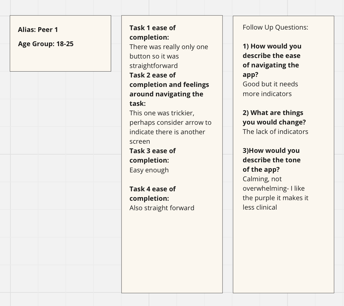
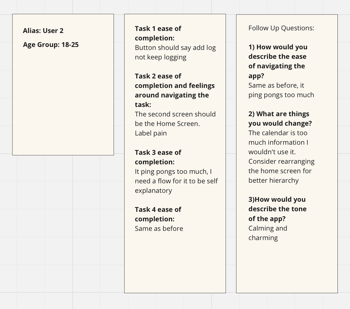
After some minor adjustments I presented to my Professor and some guest Graduate Students. The feedback I got was primarily specify my visual language with a consistent style and more white space to avoid any complications with finger interactions. With this in mind I created my style guide.
Final Results
