Through visual analysis, we aimed to uncover patterns and discern connections, using our insights to drive a deeper understanding of the data. This project was done under Professor Yvette Shen using Adobe Illustrator and Google Sheets.
Research
The key component to this assignment was collecting data. We were given a list of data sets and asked to pick at least two to track. I chose to track physical activity in tandem with mood and stress level. As a way to add context to my data I also tracked who I was with in addition to the weather conditions each day. This data was tracked using google forms in connection to google sheets. Each day I would fill out my google forms and the information would automatically be sent to a spreadsheet.
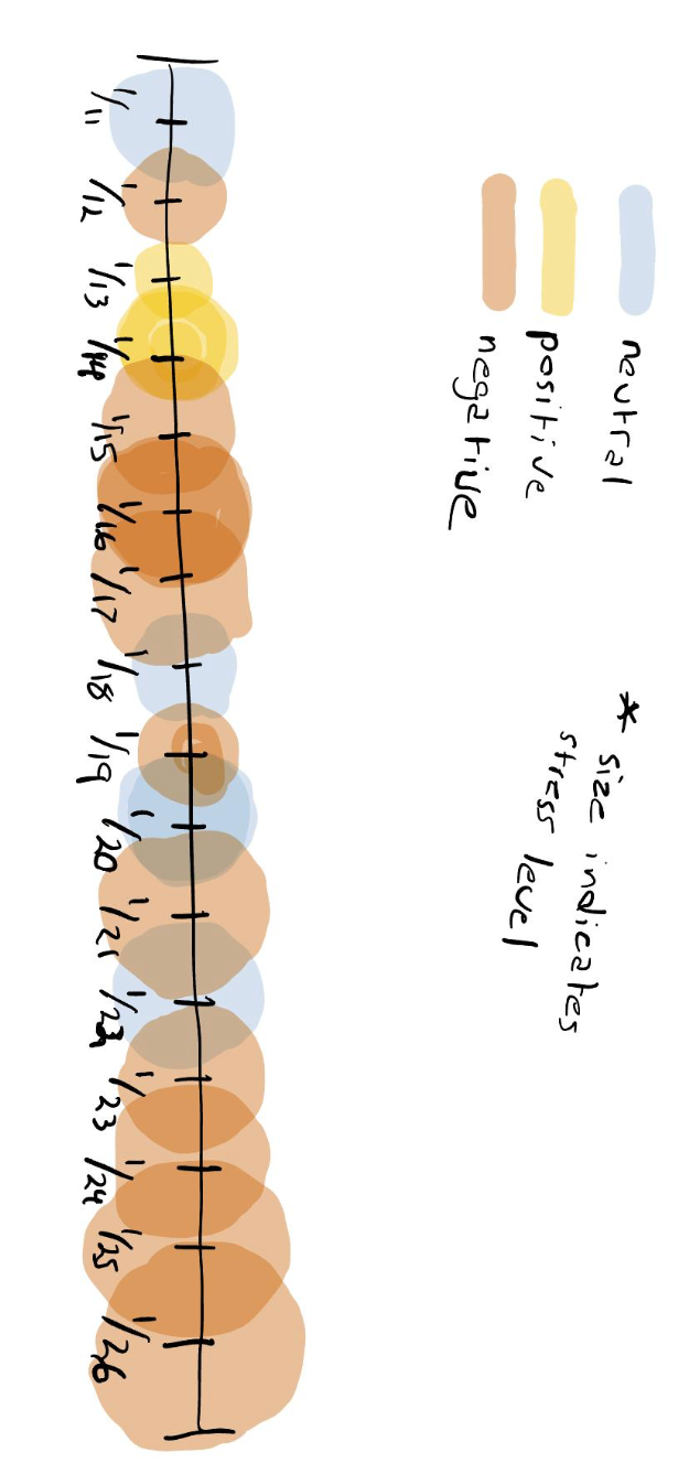
After collecting two weeks worth of data it was time to organize and code the data in one spreadsheet. For the more subjective data regarding my mood, I broke it down into positive, neutral and negative days. My stress level was tracked on a scale of 1-10, my physical activity and social interactions were organized categorically, and the data regarding the weather was largely disregarded.
Ideation
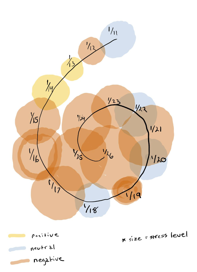
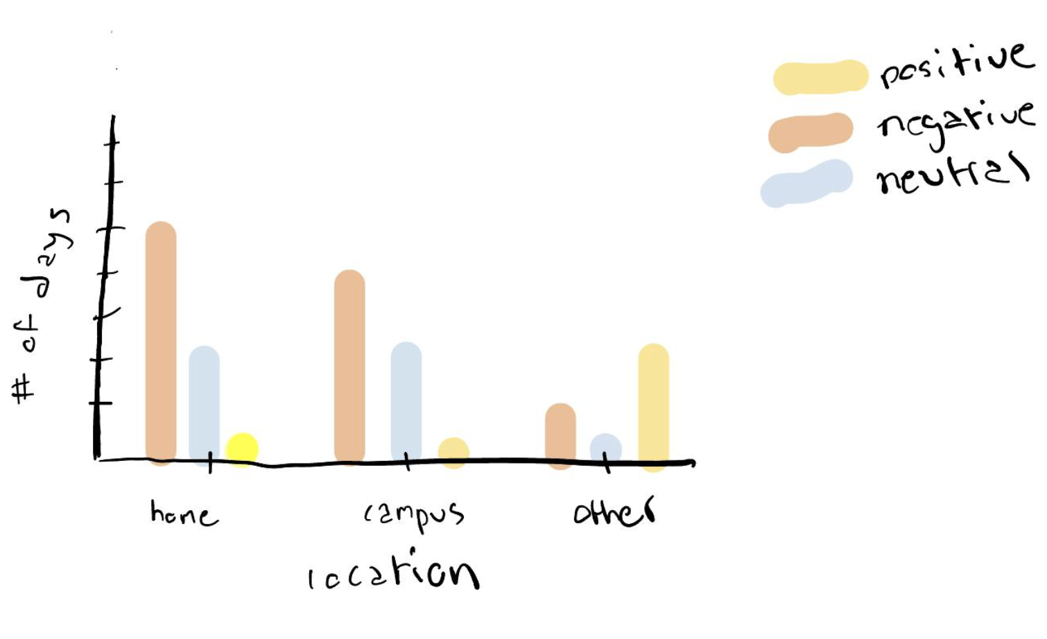
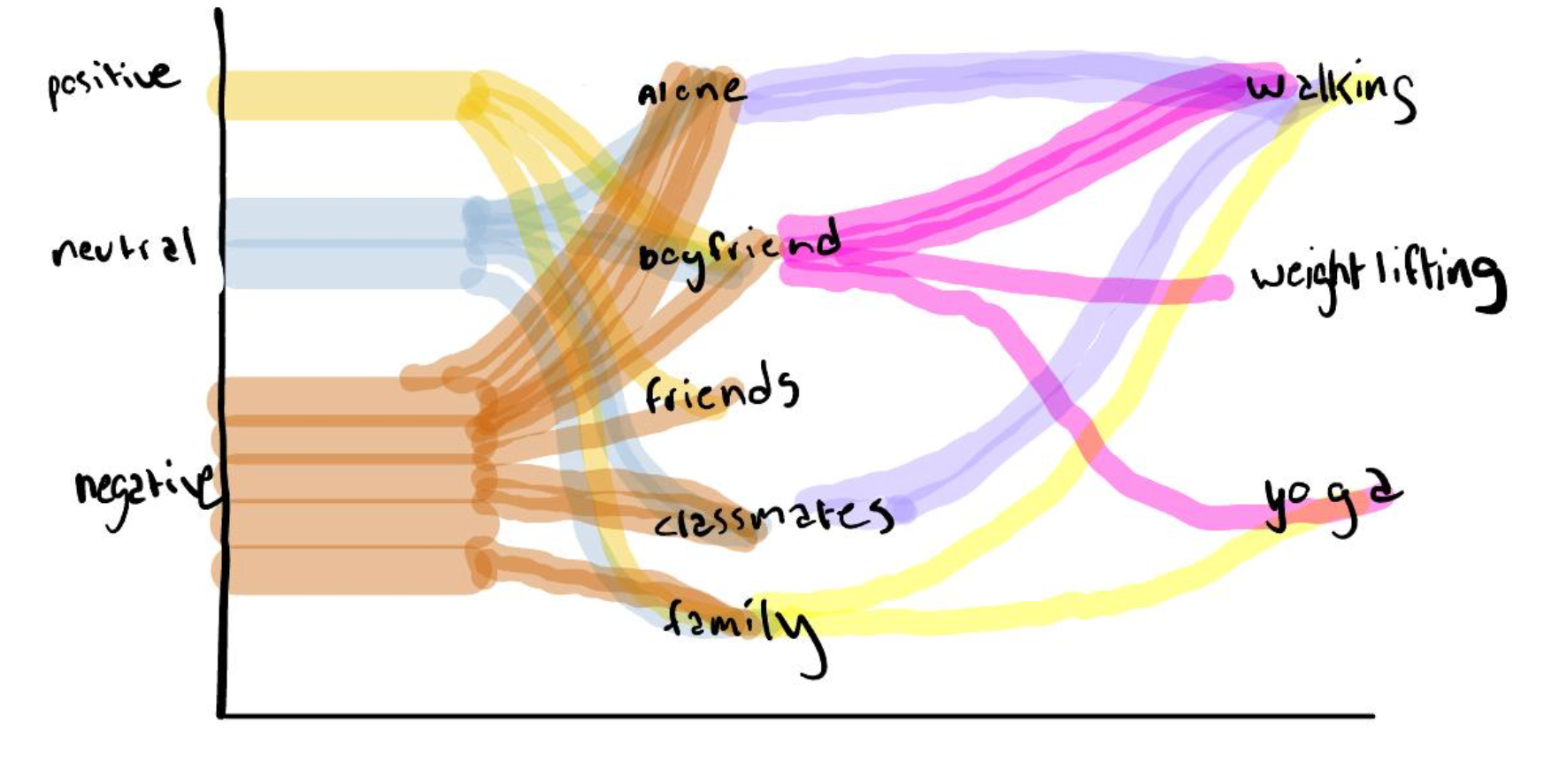
Having organized my data it was time to think about visual representation. I began by ideating ways to combine faucets of information. Some Diagrams I explored include different versions or a timeline, a bar graph, and a snaky diagram. I chose these to explore because I was looking for connects over time and between different categories of information. After receiving feedback from my peers and professor I chose to explore how to connect a snaky diagram with a timeline.
Process
With a direction in mind I began exploring variations of my intended diagram. My first exploration was done using Adobe illustrator. I chose to use a circular layout layout with the timeline as a center line to which everything was connected.
Upon recieving feedback from my professor, it made more sense to break down the right side of my diagram into with people vs alone to as to simplify the data connections and then expand upon the with people category to explain who I was with. In my next draft I also changed the color to create higher contrast between the positive and negative days, and added pictograms. Something I struggled with was how to to connect the one category, being 'with people,' to the different people I spent time with. The first option I tried to tackle this issue with was a traditional sankey diagram
After a review of my second draft, I moved back to a digital format to clean up my work. Some changes I made included switching the places of alone and with people, creating more pictograms, connecting the physical activity information to the social interaction information, and tracking the timeline using weekdays as opposed to specific days in order to make time of the week patterns easier to spot. I also found it more space effective to turn the timeline on its side.
After our last class review some changes I was encouraged to make were lightening the visual weight of may pictograms and altering the proportions of the two sections of my data visualization. I also fine tuned my work so that all type sizes, fonts and line weights were consistent. Additionally, Having been inspired by a classmate I chose to make and alternate version of my poster that was bolder with different line weights and a different style for the pictograms that lessened their visual weight. Upon feedback from my teacher it was clear that the lighter version was preferable for my final submission.
Final Outcome
